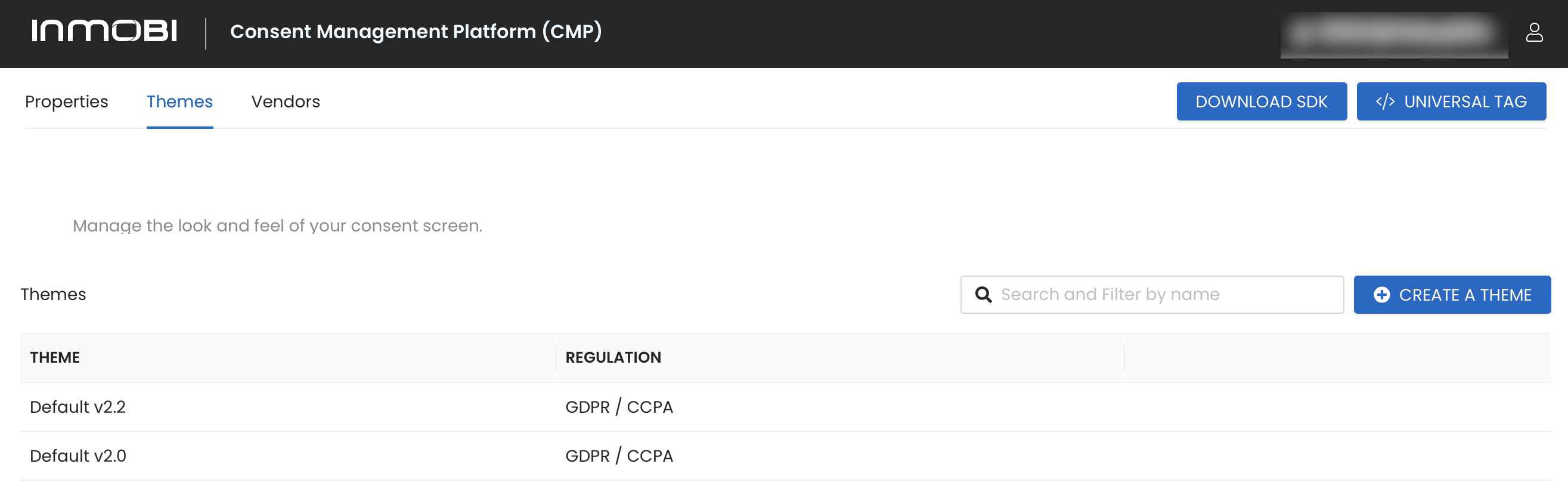
Theme Creation
InMobi CMP allows you some freedom to tailor your message, branding, and display to your audience. A Theme is a set of design and configuration settings that you can create, save, and then assign to one or more of your Sites. Themes enable you to personalize InMobi CMP’s look and feel to best suit your site style and brand identity.
- In the Privacy tab of your CMP portal, go to the Themes tab, then click Create a Theme.
- Configure your theme:
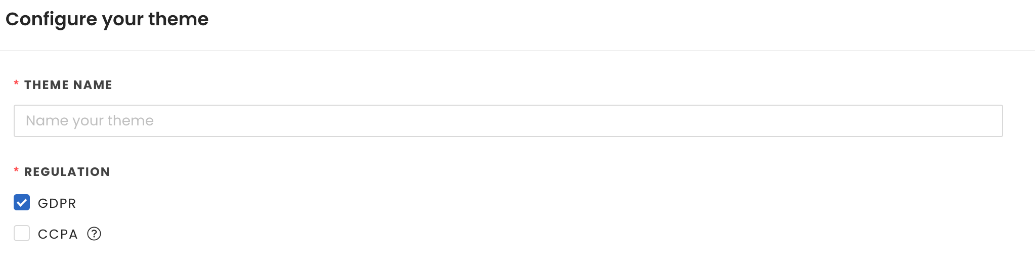
- Theme Name (required): Enter a name for your theme.
- Regulation-GDPR: GDPR is the primary regulation in EU law on data protection and privacy.
- If selected, the following sections will appear:
- Customize UI: The general layout for the CMP UI on desktop and tablet devices.
- Customize Purpose Screen
- Customize Persistent Consent Link
- Regulation-CCPA: CCPA is designed to regulate the ‘sale’ of personal information of California residents by a business and provide more privacy protections to California residents.
- If selected, the Customize "Do Not Sell My Data Screen" section will appear.
- Customize Do Not Sell My Data Screen, if you’ve selected CCPA regulation coverage, you’ll need to configure the information that will be displayed to users when they click the Do Not Sell My Data link on your site.
- It is mandatory to fill in following information fields:
- Headline Text: Allows you to provide a short title for the modal. An example is provided in the field. If you do not edit this field, it will be used as the default.
- Body Text: Allows you to provide a body copy explaining this service and how/why data collection is used on the site. An example is provided in the field. If you do not edit this field, it will be used as the default.
- Suppress CCPA Links: Select this checkbox if you only want to support the IAB CCPA Framework. This will suppress the links to the Data Deletion, Data Access, and Data Privacy Policy.
- Data Deletion Link: Allows you to provide a link to your data deletion tool, if applicable.
- Data Access Link: Allows you to provide a link to your data access tool, if applicable.
- Privacy Policy Link: Allows you to provide a link to your site privacy policy.
- Preview: No action. This shows a preview of what it might look like when it is live on your site.
- Customize UI:
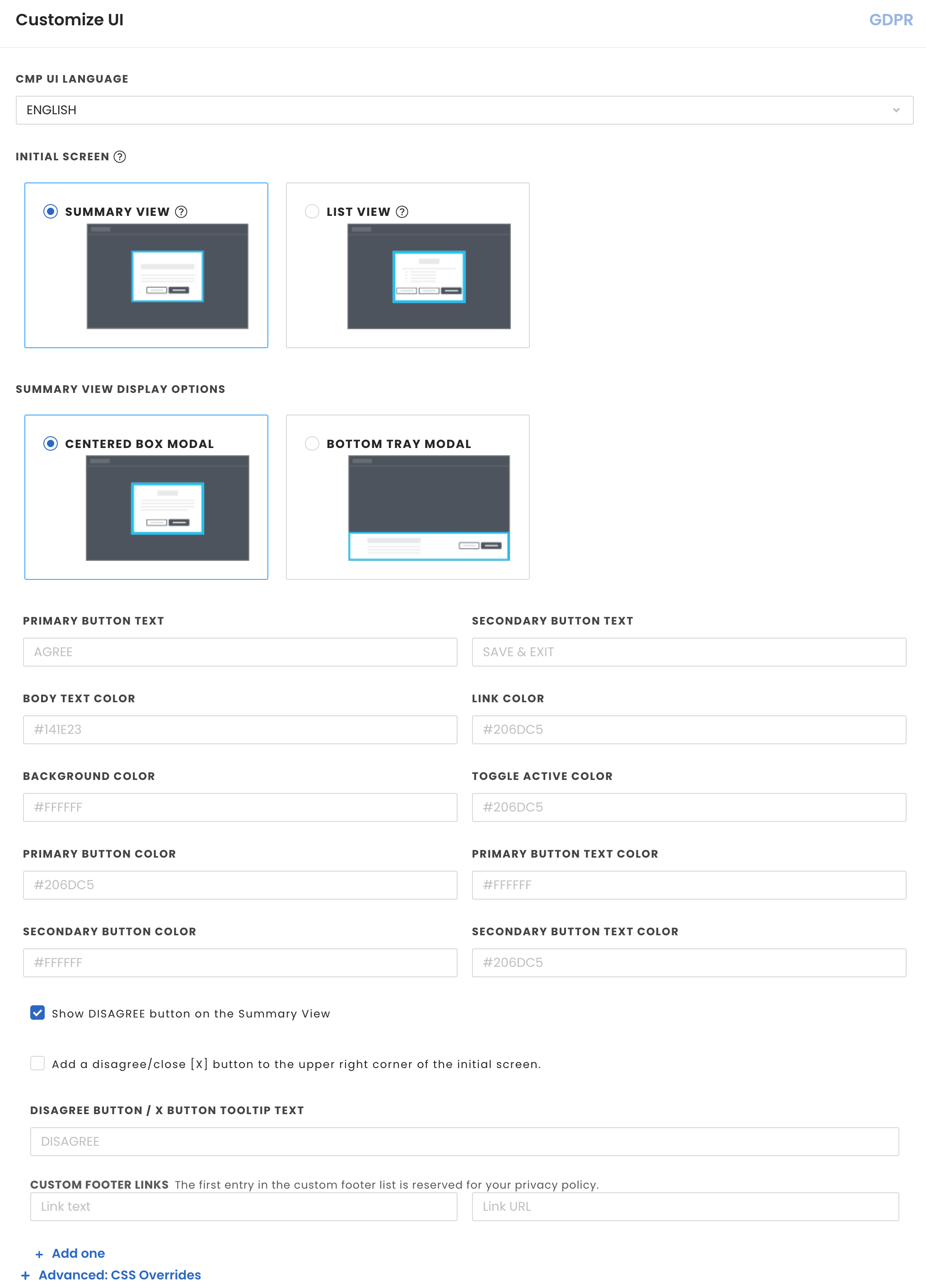
- CMP UI Language: This is the language for text in the CMP UI. There is an additional language setting in the drop-down called Auto Detect Language. This option allows you to configure the CMP to pick up the language configured for your site or if that is not set, the language of the browser. If the language doesn't match with any languages InMobi provides, it will default to English. Please see below for a list of supported languages:
| Bulgarian |
English |
Greek |
Lithuanian |
Romanian |
| Swedish |
Croatian |
Estonian |
Hungarian |
Maltese |
| Russian |
Czech |
Finnish |
Irish |
Norwegian |
| Slovak |
Danish |
Flemish |
Italian |
Polish |
| Slovenian |
Dutch |
French |
Latvian |
Portuguese |
| Spanish |
|
|
|
|
- Initial Screen: Select one of the following options:
- List View: This screen includes a list view of all the purposes and/or stacks configured, with progressive disclosures for users to proceed to provide granular consent preferences.
- Summary View: This screen includes a summary of all the purposes in the provided privacy language, with more options for users to proceed to provide granular consent preferences.
- If Summary View is selected, please select one of the following options:
- Central Box Modal: The CMP modal is centered in the screen, covering some portion of the content.
- Bottom Tray Modal: The CMP is fixed to the bottom of the browser window as a banner.
- Primary Button Text: Enter your desired text for your primary button
- Secondary Button Text: Enter your desired text for your secondary button
- Enter the desired hex color codes for the following color options:
- Body Text Color
- Link Color
- Background Color
- Toggle Active Color
- Primary Button Color
- Primary Button Text Color
- Secondary Button Color
- Secondary Button Text Color
- Show Disagree Button on the Summary View: Select this checkbox if you wish to display.
- Add a disagree/close [X] button: When checked will enable the X button on the upper right corner of the summary page.
- Disagree Button / X BUTTON TOOLTIP TEXT: If applicable, enter your desired text for your disagree button
- Custom Footer Links: Add link text and link URL for any footer links. Note: The first entry in the custom footer link list is also used as the privacy policy link in the initial screen.
- Add one/Remove one: Select to add or remove a footer link.
- Advanced: CSS Overrides: Click to expand
- CSS Overrides: If applicable, enter your CSS here. Please visit the UI CSS Overrides for more information.
- Customize Purpose Screen: here you will find Use Purposes, Use Stacks, and Configure Restrictions. This allows you to customize how you present the purposes within your CMP to your end user. You can either show a list of purposes or you select from pre-generated list of stack. The initial list is generated based on all purposes that are declared by the vendors in the vendors list.
- Use Purposes: The initial list is generated based on all purposes that are declared by the vendors in the vendors list.
- Use Stacks: To reduce the number of purposes to be disclosed to the user it is possible to group purposes into Stacks, with their own concise standard description.
- Configure Restrictions: For advanced users that want to configure Publisher Restrictions. This allows you to restrict the legal basis for purposes 2 - 10 under which the vendors can operate. Select the relevant purposes and apply a legal basis restriction by forcing (select) either consent or legitimate interest on a purpose-by-purpose basis. We show a warning symbol if a restriction is applied but the purpose selection is hidden.
- Under the Customize Persistent Consent Link, you will find 3 fields listed below.
By default, we provide a persistent consent button that will appear at the bottom right of the browser window once the user has made their selections and the CMP closes. This allows the user at any time during that visit or subsequent visits to re-prompt the CMP and make a new selection. The GDPR and IAB Europe framework require that publishers provide a persistent link on their site that allows users to edit their consent preferences at any time.
If you would like to make any additional CSS changes to your CMP outside the customization options presented on this page, please visit the section UI CSS overrides.
Otherwise, proceed directly to the instructions on how to configure Vendors.
UI CSS Overrides
If you would like to make any additional CSS changes to your CMP outside the customization options presented on the Theme’s page, you can include the CSS code in the CSS Overrides section of the Theme’s page.
Note
- This is an advanced feature and requires knowledge of using and programming CSS for HTML pages. You can find more CSS style names by looking through the styles of the CMP modal using the browser’s Element explorer.
- Before saving your changes, please test your changes by launching the GDPR Preview on the Theme’s page.
If you are using InMobi CMP Version2, we use a CSS reset within the CMP to have a consistent experience on all web sites. Therefore, please prepend all your rules with the id #qc-cmp2-ui. This will also eliminate the need to specify !important to all the rules.
Background Color
#qc-cmp2-ui {
   background: yellow;
}
Buttons
#qc-cmp2-ui button[mode="primary"] {
   background: red;
   color: white;
}
Note
- Target the different buttons separately by using the mode property. You can use either “primary”, “secondary” or “link” and it will target different buttons of our CMP.
- Please note link buttons shouldn’t have a background.
Headings
#qc-cmp2-ui h2 {
   color: red;
   font-size: 21px;
}
Texts
To change the font-family and sizing of all our texts, see below:
#qc-cmp2-ui p {
   font-family: Arial, sans-serif;
   font-size: 15px;
}
Note
To avoid unexpected style behavior, it’s not recommended to change the color using this rule because it would change the text color for ALL text as well. Please specify the color per text block.
To change the text styling of the main message of the summary page, see below:
#qc-cmp2-ui .qc-cmp2-summary-info p {
   color: red;
}
To change the text styling of the main message of the purposes, vendors and legitimate pages, see below:
#qc-cmp2-ui .qc-cmp2-consent-info p {
   color: pink;
}
To change the text styling of the list elements, see below:
#qc-cmp2-ui .qc-cmp2-list-item-title {
   color: red;
}

#qc-cmp2-ui .qc-cmp2-list-item-status {
   color: blue;
}
To change the text styling of the text INSIDE a list element you can do it like this:
Text Inside List
#qc-cmp2-ui .qc-cmp2-expandable-list p {
   color: green;
}
Headers
#qc-cmp2-ui .qc-cmp2-expandable-list li {
   color: darkblue;
}
Persistence Link
.qc-cmp2-container .qc-cmp2-persistent-link {
   background-color: red;
   color: white;
   padding: 10px;
}
Note
This is the only component that isn’t going to be prepended with the #qc-cmp2-ui id since it’s outside of the CMP UI itself. Instead, we prepend it with the .qc-cmp2-container class. If you intend to modify the padding without an increase in height, ensure to adjust the max-height rule as well (default is 30px).
 Support Center


