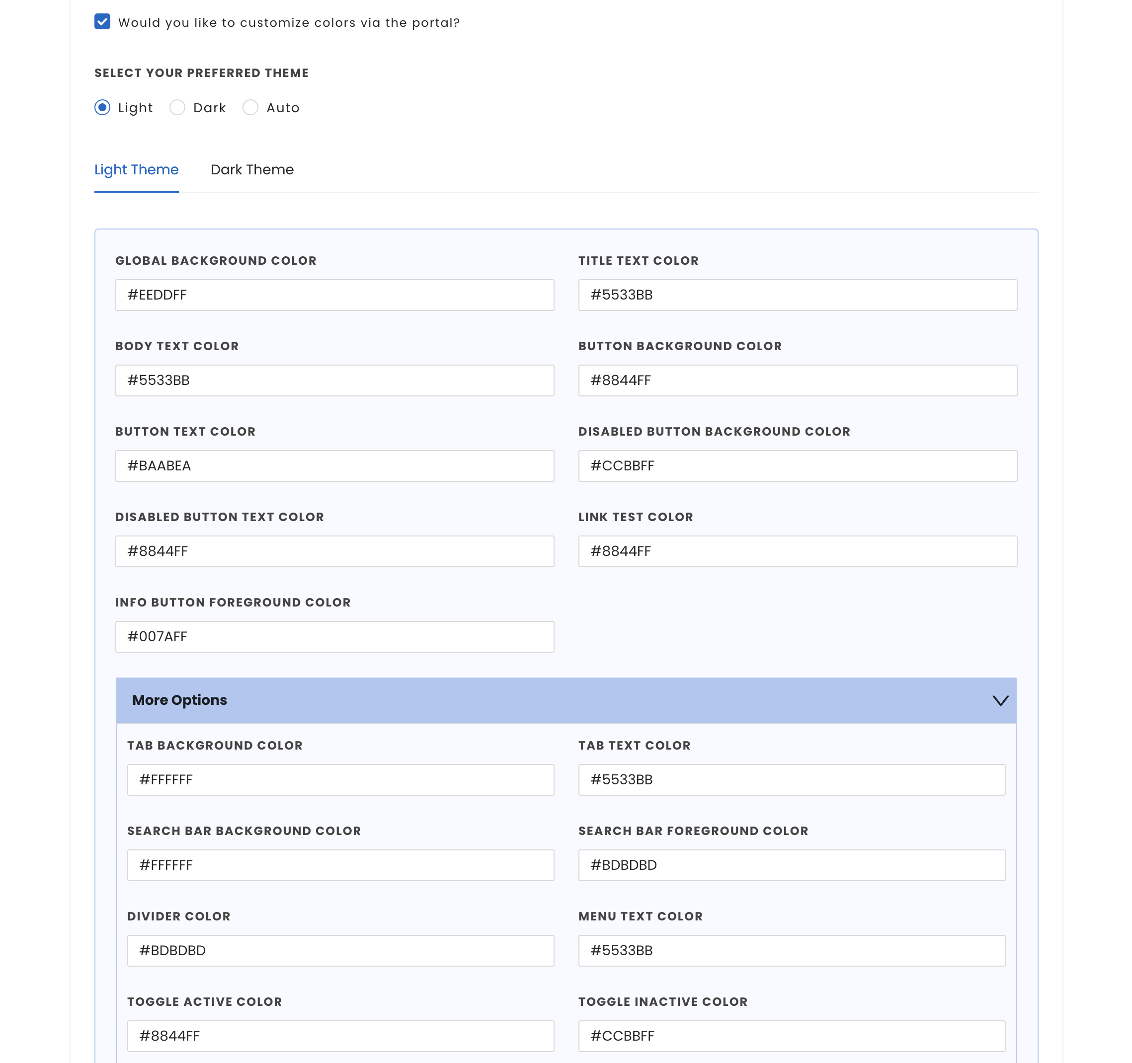
UI customization capabilities are available with our SDK. This empowers developers to tailor color schemes and font styles of all UI components within the InMobi CMP, ensuring seamless integration with the host application's UI.
Customization for iOS apps can be done both from the Themes tab on the InMobi CMP portal and in the code of the SDK.
This section details how to utilize various configuration options for text styles and colors on iOS.
You can control light/dark mode by using preferredThemeMode while calling ChoiceStyle method. It can take three values:
To customize the UI text styles and colors according to your application, follow these steps:
lightModeColors and darkModeColors respectively In the ChoiceStyle API.Example:
// Start ChoiceCMP

let style = ChoiceStyle(preferredThemeMode: .auto, lightModeColors: defaultColors, darkModeColors: defaultColors)

ChoiceCmp.shared.startChoice(pcode: "<YOUR-PCODE", delegate: self, gbcDelegate: self, style: style)
ChoiceStyle *style = [[ChoiceStyle alloc] initWithPreferredThemeMode:CMPUserInterfaceStyleAuto lightThemeStyleSheet:@"LightStyleSheet" darkThemeStyleSheet:@"DarkStyleSheet"];
[ChoiceCmp.shared startChoiceWithPcode:@"< YOUR PCODE >" delegate:self ccpaDelegate:self shouldDisplayIDFA:true style:style];
The customization of UI text styles and colors must be performed exclusively using the files and cannot be configured within the InMobi CMP portal.
The following components can be configured:
| Property name | Description |
|---|---|
| dividerColor | Page divider color |
| tabBackgroundColor | Tab background color (for example, the vendor tabs) |
| tabForegroundColor | Tab foreground color (for example, the vendor tabs) |
| searchBarBackgroundColor | Search field background color |
| searchBarForegroundColor | Search field foreground color |
| infoButtonForegroundColor | Information (i) button foreground color |
| infoScreenBackgroundColor | Information screen background color |
| infoScreenForegroundColor | Information screen foreground color |
| toggleActiveColor | Toggle button active color |
| toggleInactiveColor | Toggle button in-active color |
| globalTextColor | Main (global) text color |
| globalBackgroundColor | Main (or global) background color |
| titleTextColor | Title text color |
| bodyTextColor | Body text color |
| listTextColor | Color of the text in the lists (like vendor list) |
| tabTextColor | Tab text color (for example the vendor tabs) |
| menuTextColor | Menu text color (example: ???) |
| linkTextColor | Link text color (hyperlinks and links between the different pages) |
| buttonTextColorButton text color | Button text color |
| buttonDisabledTextColor | Button text color in disabled state |
| buttonBackgroundColor | Button background color |
| buttonDisabledBackgroundColor | Button background color in disabled state |

Enter Hex code values for colours while customizing them. For eg. #FF0000 for red.
While color customization can be done through code, InMobi CMP gives priority to color customization enabled through the portal. First, we will consider the customisations from the portal; if there are none, we will consider the customisations made through code. In case there are no changes made through code, we will apply the default colours.
There is an option to customize the fonts utilized in the InMobi CMP. By default, the OS default font is applied. To configure custom fonts, the host application must support their integration. For more information, see Adding a Custom Font to Your App
To find the correct names for utilizing custom fonts in your source code, please refer to the dedicated section: Use Your Custom Font in Source Code.
You can leverage boldFont parameter provided in ChoiceStyle to set the font.
let boldFont = ChoiceFont()

boldFont.fontName = "<FONT NAME>"

 let style = ChoiceStyle(preferredThemeMode: .auto, lightModeColors: defaultColors, darkModeColors: defaultColors, boldFont: boldFont)

ChoiceCmp.shared.startChoice(pcode: "YOUR PCODE", delegate: self, gbcDelegate: self, style: style)
//
//  AppDelegate.swift
//  Example
//
//  Copyright © 2024 InMobi. All rights reserved.
//

import UIKit
import InMobiCMP

@UIApplicationMain
class AppDelegate: UIResponder, UIApplicationDelegate, ChoiceCmpDelegate, CCPADelegate {

    func application(_ application: UIApplication,   didFinishLaunchingWithOptions launchOptions: [UIApplication.LaunchOptionsKey: Any]?) -> Bool {
   startChoice()
        return true
    }

   func startChoice() {
        // Start ChoiceCMP
        let boldFont = ChoiceFont()
        boldFont.fontName = "FONT NAME"
        let style = ChoiceStyle(preferredThemeMode: .auto, lightModeColors: defaultColors, darkModeColors: defaultColors, boldFont: boldFont)
        ChoiceCmp.shared.startChoice(pcode: "YOUR-PCODE", delegate: self, gbcDelegate: self, style: style)
    }

    var defaultColors : ChoiceColor {
        let choiceColor = ChoiceColor()
        choiceColor.dividerColor = "#CCBBFF"
        choiceColor.tabBackgroundColor = "#BAABEA"
        choiceColor.tabForegroundColor = "#8844FF"
        choiceColor.searchBarBackgroundColor = "#CCBBFF"
        choiceColor.searchBarForegroundColor = "#BAABEA"
        choiceColor.infoButtonForegroundColor = "#8844FF"
        choiceColor.infoScreenBackgroundColor = "#CCBBFF"
        choiceColor.infoScreenForegroundColor = "#5533BB"
        choiceColor.toggleActiveColor = "#8844FF"
        choiceColor.toggleInactiveColor = "#CCBBFF"
        choiceColor.globalTextColor = "#5533BB"
        choiceColor.globalBackgroundColor = "#EEDDFF"
        choiceColor.titleTextColor = "#5533BB"
        choiceColor.bodyTextColor = "#5533BB"
        choiceColor.listTextColor = "#5533BB"
        choiceColor.tabTextColor = "#5533BB"
        choiceColor.menuTextColor = "#5533BB"
        choiceColor.linkTextColor = "#8844FF"
        choiceColor.buttonTextColor = "#BAABEA"
        choiceColor.buttonDisabledTextColor = "#8844FF"
        choiceColor.buttonBackgroundColor = "#8844FF"
        choiceColor.buttonDisabledBackgroundColor = "#CCBBFF"
        return choiceColor
    }
}
By installing this SDK update, you agree that your Children Privacy Compliance setting remains accurate or that you will update that setting, whenever there is a change in your app's audience. You may update the app's Children Privacy Compliance settings at https://publisher.inmobi.com/my-inventory/app-and-placements.