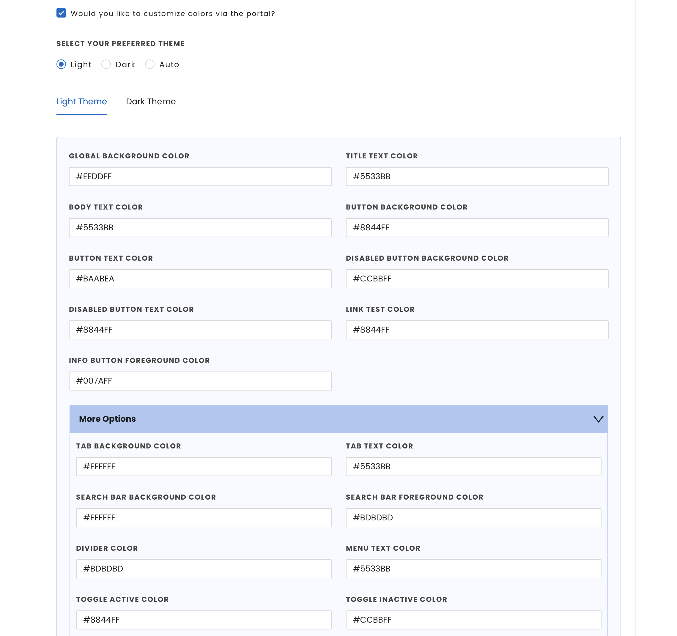
UI customization capabilities are available with our SDK. This enables developers to tailor color schemes and font styles of all UI components within the InMobi CMP, ensuring seamless integration with the host application's UI.
Customization for Android apps can be done both from the Themes tab on the InMobi CMP portal and in the code of the SDK.
This section details how to utilize various configuration options for text styles and colors on Android.
You can control light/dark mode by using ThemeMode while calling startChoice method. It can take three values:

While color customization can be done through code, InMobi CMP gives priority to color customization enabled through the portal. First, we will consider the customisations from the portal; if there are none, we will consider the customisations made through code. In case there are no changes made through code, we will apply the default colours.
You can pass the ChoiceColor model to set themes in light and dark mode. If only one model is passed in AUTO themeMode, InMobi CMP SDK will use the same model for both light and dark mode. To create your theme, follow the steps:
ChoiceColor model and set all the necessary colors for that model.ChoiceStyle object through the builder and set the appropriate ChoiceColor object for light and dark mode resources.ChoiceStyle object in the startChoice method.
fun initChoice() {
  ChoiceCmp.startChoice(
      app = application,
      packageId = packageId,
      pCode = "your pcode",
      callback= choiceCmpCallback,
      choiceStyle = ChoiceStyle.Builder().setThemeMode(ThemeMode.AUTO).
            setLightModeColors(getColors()).
            setDarkModeColors(getColors()).build()
  )
}

private fun getColors(): ChoiceColor {
    val choiceColor = ChoiceColor()
    choiceColor.dividerColor = getColorInt(R.color.dividerColor)
    choiceColor.tabBackgroundColor = getColorInt(R.color.tabBackgroundColor)
    choiceColor.tabTextColor = getColorInt(R.color.tabTextColor)
    choiceColor.searchBarBackgroundColor = getColorInt(R.color.searchBarBackgroundColor)
    choiceColor.searchBarForegroundColor = getColorInt(R.color.searchBarForegroundColor)
    choiceColor.toggleActiveColor = getColorInt(R.color.toggleActiveColor)
    choiceColor.toggleInactiveColor = getColorInt(R.color.toggleInactiveColor)
    choiceColor.globalBackgroundColor = getColorInt(R.color.globalBackgroundColor)
    choiceColor.titleTextColor = getColorInt(R.color.titleTextColor)
    choiceColor.bodyTextColor = getColorInt(R.color.bodyTextColor)
    choiceColor.menuTextColor = getColorInt(R.color.menuTextColor)
    choiceColor.linkTextColor = Color.parseColor(R.color.linkTextColor)
    choiceColor.buttonTextColor = getColorInt(R.color.buttonTextColor)
    choiceColor.buttonBackgroundColor = getColorInt(R.color.buttonBackgroundColor)
    choiceColor.buttonDisabledTextColor = getColorInt(R.color.buttonDisabledTextColor)
    choiceColor.buttonDisabledBackgroundColor = getColorInt(R.color.buttonDisabledBackgroundColor)
    return choiceColor
}

private fun getColorInt(colorRes: Int): Int {
    return ContextCompat.getColor(this, colorRes)
}
If you wish to customize the fonts used in the Choice CMP, follow the instructions below:
startChoice method. The table below provides details on the two types of supported fonts and their corresponding property names in the ChoiceStyle class in the CMP:| Property name | Description |
|---|---|
regularFont |
Name of the font used for the CMP |
boldFont |
Name of the bold font used for the CMP |
Below is an example demonstrating how the startChoice call will appear once you've integrated custom fonts:
ChoiceCmp.startChoice(
      app = application,
      packageId = packageId,
      pCode = "your pcode",
      callback= choiceCmpCallback,
      choiceStyle = ChoiceStyle.Builder().setThemeMode(ThemeMode.AUTO).
            setLightModeColors(getColors()).
            setDarkModeColors(getColors()).
            setRegularFont(R.font.open_sans_regular).
            setBoldFont(R.font.luckiest_guy).build()
  )
By installing this SDK update, you agree that your Children Privacy Compliance setting remains accurate or that you will update that setting, whenever there is a change in your app's audience. You may update the app's Children Privacy Compliance settings at https://publisher.inmobi.com/my-inventory/app-and-placements.
 Support Center
