Create Theme
After creating your property, it's time to create a theme for it. InMobi CMP allows you the freedom to tailor your message, branding, and display to your audience.
A theme is a customizable bundle of design and configuration settings, like layout, text, colors, and legal link behavior, that defines the look and feel of your CMP. Once created, you can save and assign themes to multiple sites.
- Navigate to the Themes tab and click Create Theme. Select Site Theme from the dropdown.
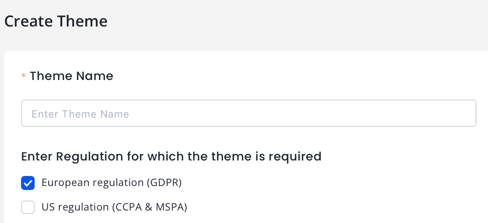
- Theme Name (required): Enter a name for your theme.
- For Regulation for which the theme is required, select European regulation (GDPR) or US regulation (CCPA & MSPA), or both. For more information, see GDPR and CCPA.
The theme creation process is divided into five sections for each regulation.
- Language & Text
- Colors
- Customize Privacy
- Privacy Widget
- Override CSS
GDPR Consent Settings
Language and Text
Basic
- Choose from supported languages or use Auto‑Detect for the CMP UI.
- Choose Layout of your consent pop-up.
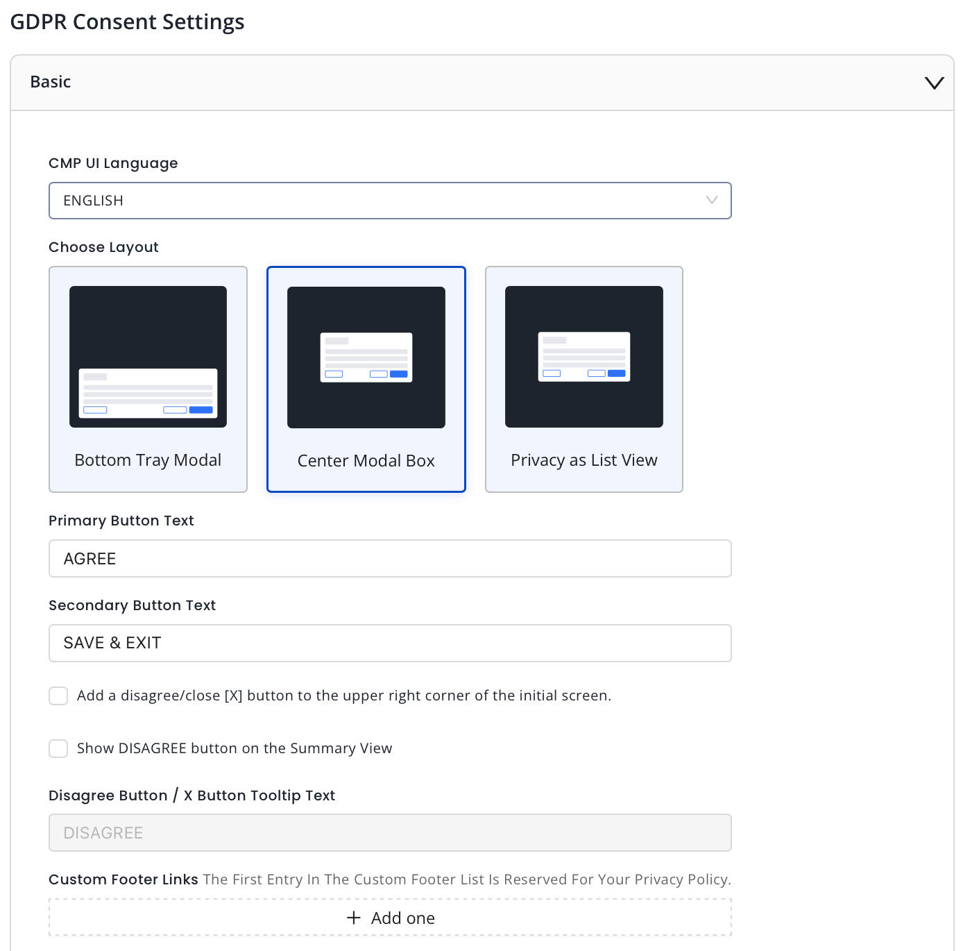
- Enter the desired text for your primary button.
- Enter the desired text for your secondary button.
- Add a disagree/close [X] button to the upper right corner of the initial screen: Check this box to display the X button on the upper right corner of the summary page.
- Show DISAGREE button on the Summary View: Check this box to display a DISAGREE BUTTON.
- Enter the desired text for your Disagree button if selected in the previous step.
- Add custom footer links as needed. The first entry is reserved as the privacy policy link.
Advanced Customization (for Premium properties only)
- Choose from supported languages for the CMP UI.
- Enter the desired text for your primary button.
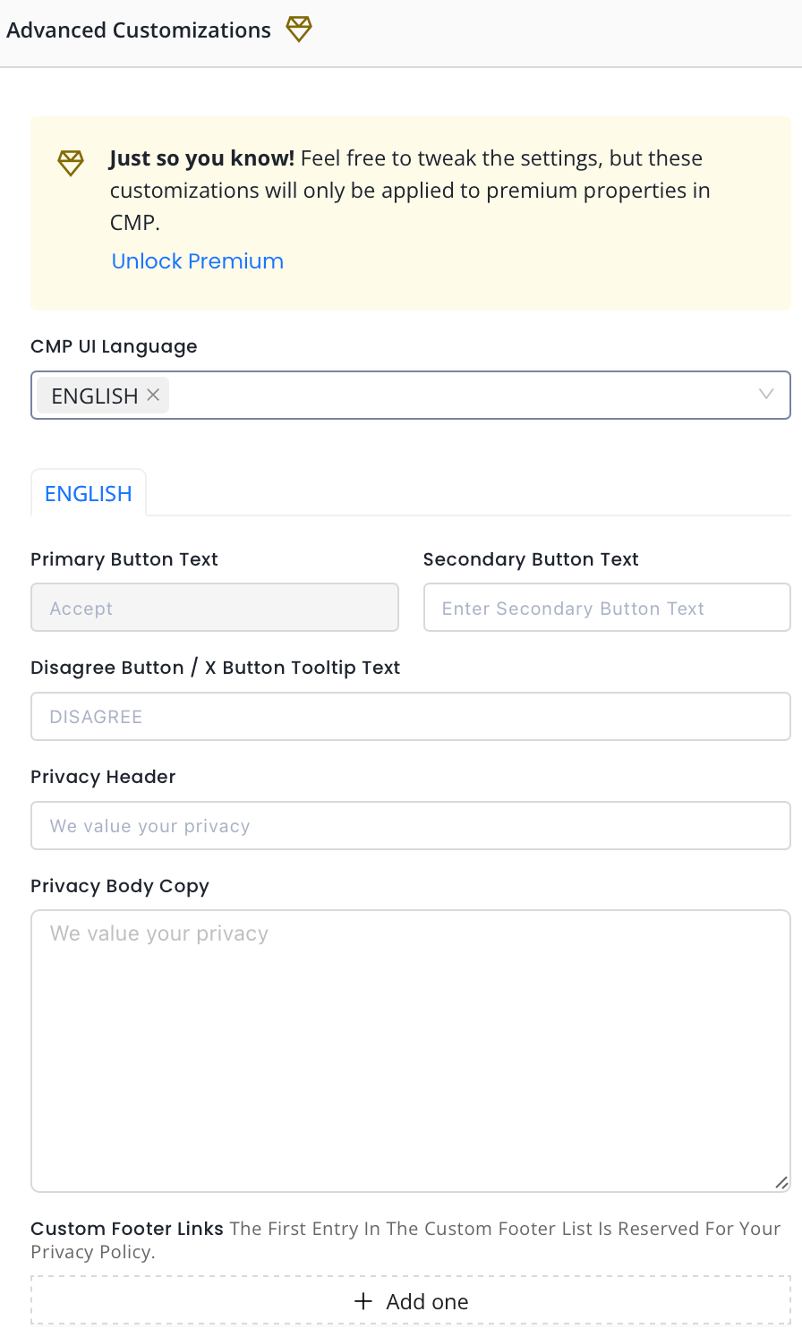
- Enter the desired text for your secondary button.
- Enter the desired text for your Disagree button or X Button Tooltip text.
- Enter the Privacy Header text.
- Add the Privacy Body copy.
- Add custom footer links as needed. The first entry is reserved as the privacy policy link.
Consent or Pay (for Premium properties only)
- Choose from supported languages for the CMP UI.
- Choose Layout of your consent pop-up.
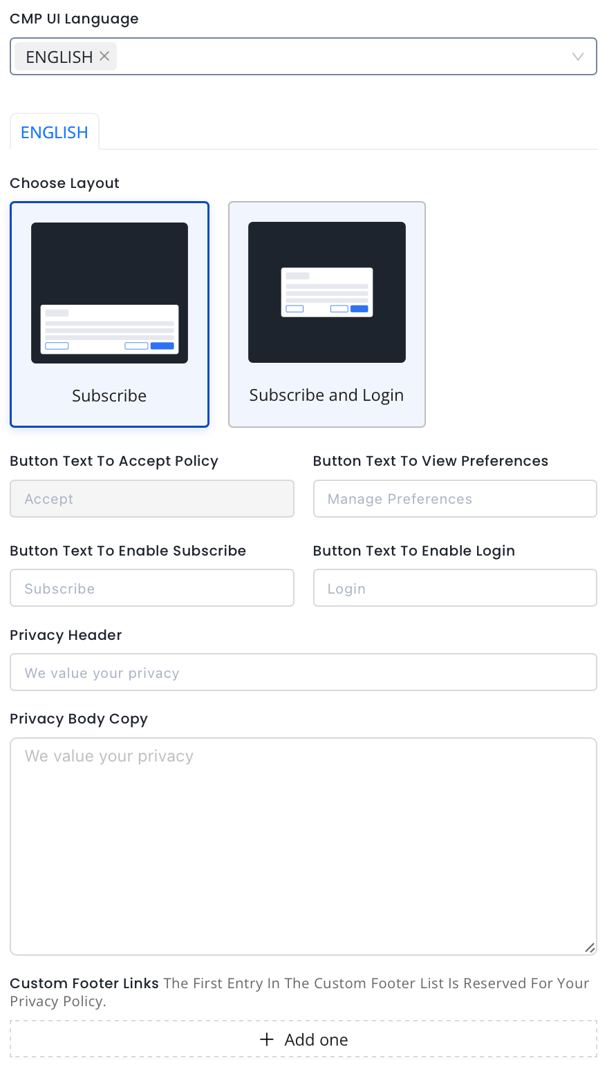
- Enter the Button Text for Accept Policy.
- Enter Button Text to View Preferences.
- Enter Button Text to Enable Subscribe.
- Enter Button Text to Enable Login.
- Enter the Privacy Header text.
- Add the Privacy Body Copy.
- Add custom footer links as needed. The first entry is reserved as the privacy policy link.
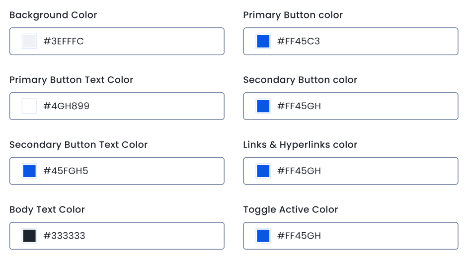
Colors
- Set colors for your site.
Customize Privacy
- Select TCF Version. We recommend using the latest TCF 2.2.
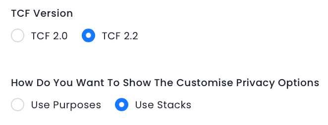
- Choose How Do You Want To Show The Customise Privacy Options.
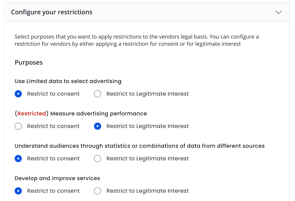
- Select the purposes which you want to apply restrictions to the vendors' legal basis.
Privacy Widget
- Check the box to display the Persistent Consent Link.
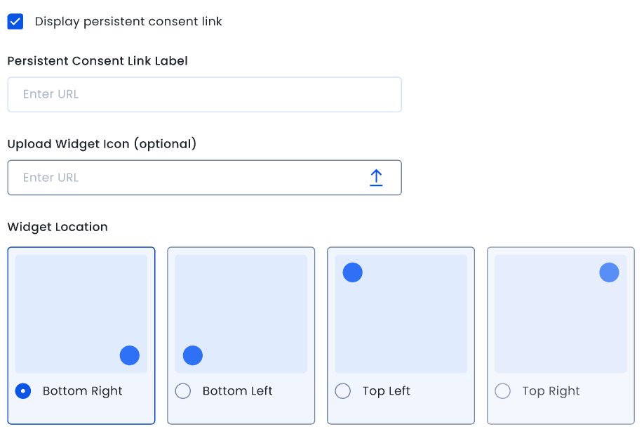
- Add the Persistent Consistent Link Label.
- Upload Widget icon if required.
- Select Widget location.
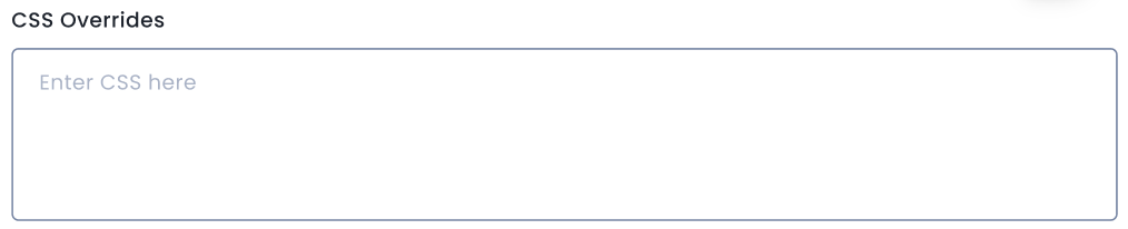
Override CSS
- For further customization apart from those on the Themes page, see UI CSS Overrides. Add the CSS overrides in the box.
- Click Create Theme.
US Consent Settings
Language and Text
- Enter Headline text.
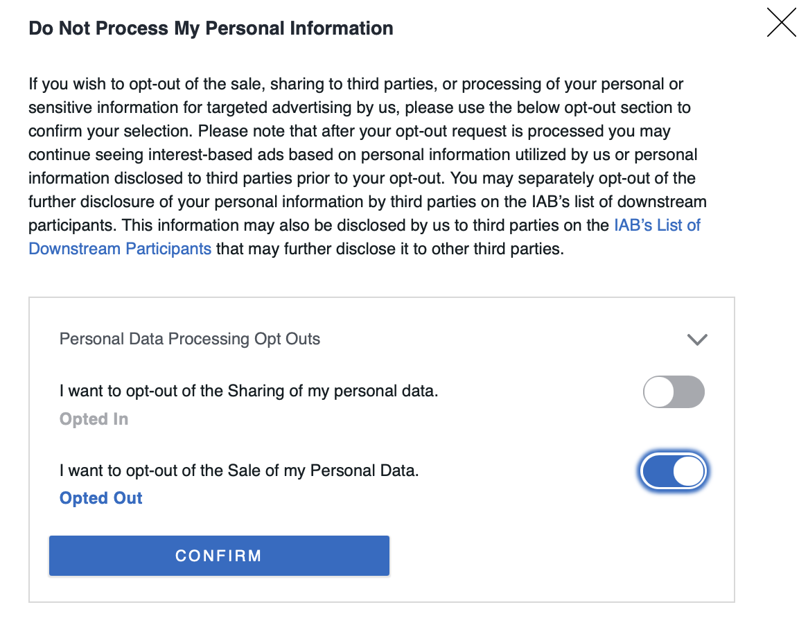
- Enter Body text.
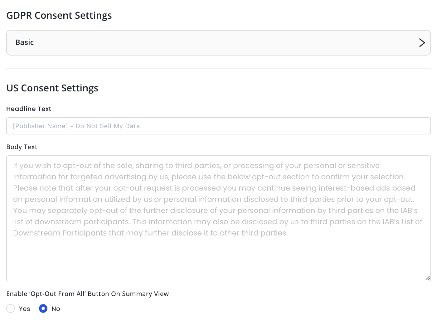
- Choose to enable the 'Opt-Out From All' on the Summary view.
- Select the Suppress MSPA Links checkbox if you only want to support the IAB CCPA Framework. This will suppress the links to the Data Deletion, Data Access, and Data Privacy Policy.
- Add Link Text and Link URL to your Data Deletion tool, if applicable.
- Add Link Text and Link URL to your Data Access tool, if applicable.
- Add Link Text and Link URL to your Privacy Policy, if applicable.
- You will now be able to showcase the opt in/opt-out status at every toggle while asking users to set their purposes.
Colors
- Set colors for your site.
Customize Privacy
- Select TCF Version. We recommend using the latest TCF 2.2.
- Choose How Do You Want To Show The Customise Privacy Options.
- Select the purposes which you want to apply restrictions to the vendors' legal basis.
Privacy Widget
- Check the box to display the Persistent Consent Link.
- Add the Persistent Consistent Link Label.
- Upload Widget icon if required.
- Select Widget location.
Override CSS
- For further customization apart from those on the Themes page, see UI CSS Overrides. Add the CSS overrides in the box.
- Click Create Theme.
UI CSS Overrides
If you would like to make any additional CSS changes to your CMP outside the customization options presented on the Theme’s page, you can include the CSS code in the CSS Overrides section of the Theme’s page.
Note
- This is an advanced feature and requires knowledge of using and programming CSS for HTML pages. You can find more CSS style names by looking through the styles of the CMP modal using the browser’s Element explorer.
- Before saving your changes, please test your changes by launching the GDPR Preview on the Theme’s page.
If you are using InMobi CMP Version2, we use a CSS reset within the CMP to have a consistent experience on all websites. Therefore, please prepend all your rules with the id #qc-cmp2-ui. This will also eliminate the need to specify !important to all the rules.
Background Color
#qc-cmp2-ui {
   background: yellow;
}
Buttons
#qc-cmp2-ui button[mode="primary"] {
   background: red;
   color: white;
}
Note
- Target the different buttons separately by using the mode property. You can use either “primary”, “secondary”, or “link”, and it will target different buttons of our CMP.
- Please note that link buttons shouldn’t have a background.
Headings
#qc-cmp2-ui h2 {
   color: red;
   font-size: 21px;
}
Texts
To change the font-family and sizing of all our texts, see below:
#qc-cmp2-ui p {
   font-family: Arial, sans-serif;
   font-size: 15px;
}
Note
To avoid unexpected style behavior, it’s not recommended to change the color using this rule because it would change the text color for ALL text as well. Please specify the color per text block.
To change the text styling of the main message of the summary page, see below:
#qc-cmp2-ui .qc-cmp2-summary-info p {
   color: red;
}
To change the text styling of the main message of the purposes, vendors, and legitimate pages, see below:
#qc-cmp2-ui .qc-cmp2-consent-info p {
   color: pink;
}
To change the text styling of the list elements, see below:
#qc-cmp2-ui .qc-cmp2-list-item-title {
   color: red;
}

#qc-cmp2-ui .qc-cmp2-list-item-status {
   color: blue;
}
To change the text styling of the text INSIDE a list element you can do it like this:
Text Inside List
#qc-cmp2-ui .qc-cmp2-expandable-list p {
   color: green;
}
Headers
#qc-cmp2-ui .qc-cmp2-expandable-list li {
   color: darkblue;
}
Persistence Link
.qc-cmp2-container .qc-cmp2-persistent-link {
   background-color: red;
   color: white;
   padding: 10px;
}
Note
This is the only component that isn’t going to be prepended with the #qc-cmp2-ui id since it’s outside of the CMP UI itself. Instead, we prepend it with the .qc-cmp2-container class. If you intend to modify the padding without an increase in height, ensure to adjust the max-height rule as well (default is 30px).
 Support Center


